What CSS classes are used in the Main Nav menu?
These are the CSS classes that sometimes get edited/deleted on accident. That’s okay. Mistakes happen and that is why we have this Q&A.
FIRST, make sure you can find the CSS field, as WP often hides it from users. Go to Appearance > Menus and at the top of the page is a drop down that reads “Screen Options”. Expand that and under “Show advanced menu properties” make sure the “CSS field” option is checked.
Get Started button in the main navigation
- If the button style accidentally gets deleted or is not appearing, here is where you edit that to get it back:
- Appearance > Menus > Select the Main Nav (Header) > Expand Get Started > ensure the class “menu-btn” appears in the CSS class field
Secondary Menu Icon Classes
- Your Secondary Nav 2 has several links with icons next to them. To get those icons, the following CSS is used:
- Support icons: “nav-icon nav-icon–support“
- Login icons: “menu-button nav-icon nav-icon–user“
Hidden except in Mobile Navigation items
- The main menu may have a bunch of pages listed that do not appear in the main navigation on desktop, but they do appear on mobile devices.
- In the menu link in Appearance > Menus > main navigation > These extra pages have a menu class of “mobile-only”.
What CSS classes are used on blocks?
We built a lot of functionality into your Page Block Library to give you a lot of variety in how you build your site. So here is a list (provided by our developer and designer) of specific CSS and the block that class pertains to.
Imported Classes
If you see CSS that starts with “imported-oms-[block type]“, that block has been imported from Gutenberg and must be deleted/replaced with a new Elementor block. (The CSS will override other CSS entered.)
Unique Classes
Add drop shadow to a few different elements. This is intended for cards, for a whole row, for widgets that appear in some “sidebar” layouts, and for accordion/toggles
Class Names that get applied to the row (use one at a time):
- .depth–cards
- .depth–row
- .depth–sidebar-widget
- .depth–accordions
Add structure to Stats Page Block with divider lines. This is intended for the Stats Page Block only.
Class Name that gets applied to the row:
- .oms-divider
Add rounded corners to an image/text block.
Class Name that gets applied to the image:
- rounded
Apply Gradient to Block
Block Section background: The Elementor UI doesn’t allow for more than two colors in a background gradient, Gradient 1 (Blue/Green) consists of more than 2 colors, for this reason, we are using classes instead of the Elementor UI.
Class Names that get applied to the section (use one at a time):
- .oms-bg-gradient–gradient-1
This is the Cobalt > Teal > Lime - .oms-bg-gradient–gradient-2
This is the Navy > Cobalt
Apply texture to Page Block Section background
The Elementor UI allows for background images and overlays, but we wanted a little more sophistication, so we are using classes for “textured” page blocks
Class Names that get applied to the section (use both classes from the 3 options below, but only use 1 option at a time):
- .oms-bg-media .oms-bg-media–white
- .oms-bg-media .oms-bg-media–light-gray
- .oms-bg-media .oms-bg-media–navy
Additional Button Modifiers
We created a third button type. We have not 100% settled on the color yet. I anticipate some feedback from the client
When applying classes for buttons, try to only use one of the following:
- .btn-primary
- .btn-secondary
- .btn-tertiary
When applying the .btn-larger class, you can pair that class with any of the 3 listed above
Class Names that are available in the Formats dropdown::
- .btn-tertiary
- .btn-larger
How do I change the background color of a block?
Note: Do not change the background color of imported blocks. Instead, bring in a new block and copy/paste the content in. Then you can change the background color using the instructions below.
To change the color of a page block, here are the steps you take once you’re in the Elementor editor:
- Using your “Navigation” or “Structure” popup, select the top most container for the block you’ve selected. The container should be named the same as the block, for example “Accordion (White)”
- The left sidebar will show the Container editor and three tabs. Toggle to the second tab, Style.
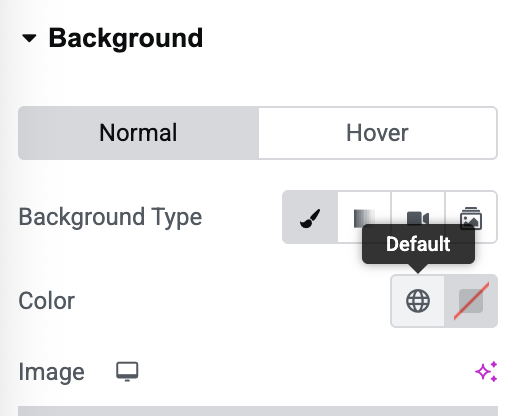
- The first option will be your background color and image selector. Find “Color” and select the globe (“default”) icon to see global colors our developer has saved to your site.

- Choose the color you’d like to use from the options labeled “BG Color”
- Scroll to the bottom of the same tab and expand the “Text Settings”. Select the correct color to match your new background color. “Default” = black text on light background. “Light” = white text on dark background.
- Save your changes.